
This past week, Bangalore received copious amounts of rainfall on consecutive nights. A heavy spell of rainfall with 76 mm of precipitation was recorded in the city starting on August 15th night. There was more rain on the following day, with Bangalore receiving another 38 mm of precipitation. (You can take a look at the data yourself here.)
On average, Bangalore receives only 137 mm of rainfall in August, which means that with the two days of rainfall, Bangalore has already exceeded the month’s quota of expected rainfall! (with 144mm).
What does this mean? Do we truly have a freak set of rainfall set on our hands? Or can this be normal even when it doesn’t agree with the average numbers? This post aims to make sense of rainfall and variability in Bangalore.
Understanding the Basic Climate Profile
Let’s start by trying to understand the basic rainfall profile of Bangalore. On average, Bangalore receives 970 mm of rainfall in a year.
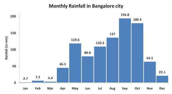
The graph above shows the average monthly rainfall distribution for Bangalore city. (source). One can notice two “peaks” in rainfall received, a large peak around September: the primary monsoon season; and a secondary peak in May: which represents Bangalore’s summer showers.
Average rainfall doesn’t tell us much!
Now all this is fine and factually quite accurate, but averages and monthly “expected” rainfall values tell a very incomplete story. The Indian Met Department loves to talk about “expected” rainfall quantities and whether the actual rainfall received was in deficit or excess. Read any of their daily, weekly or monthly reports meant for direct government/news agency/public consumption, and the story is the same.
The devil, as it happens, is in climate variability. Every year, in all parts of India, there is natural and inevitable deviation from the average rainfall quantities. Some months are higher, some lower, heavy showers happen in the first week of a month in one year, the last week in another. It is only when you see a weather event that goes beyond the expected range of variation that it becomes an “extreme” weather event.
Let’s explore this with the rainfall in Bangalore from last week: just how special was such a high rainfall event? To understand that, we first need to understand how monthly rainfall varies naturally year on year.
Getting Data for Analysis
Unfortunately, the Indian Met Department does not release historical time-series rainfall datasets for individual stations, even if they are important ones like Bangalore. The closest substitute one can find are gridded data sets. Gridded data sets are built by taking station data, running computations and calculating the numbers for equal, square blocks of land. These are really useful for complex climate modeling exercises, but with care, they can be used as well.
The Research Institute for Humanity and Nature, Japan have developed an excellent gridded database of 50 years of daily rainfall covering all of South Asia, called APHRODITE. (It’s available for free download, but bewarned: file sizes are huge and you need programming skills to extract data out of it). I decided to use a grid box from this for analyzing Bangalore’s climate.
Below is a map of Bangalore showing the location of the Bangalore city weather station, the APHRODITE grid box chosen and outlines of the Bangalore urban and rural districts. (Hat-Tip to @zenrainman for help in locating the Bangalore weather station.) Click here for an interactive map.

So what do the numbers say?
Before we can blindly trust all the results that this new source of data tells us, we need to check if the numbers match up to what we already know. Below is a graph of the monthly average rainfall values. APHRODITE provides data from 1951-2007, and below is the average of the first 30 years.
")
On comparison with the previous graph, the overall pattern of monthly rainfall seems unchanged, however: the rainfall amounts that APHRODITE gives us seem to be almost uniformly around ~70% of values obtained by the IMD. Thus, the average rainfall in August here is about 97mm instead of 130mm. This is likely because APHRODITE data is “built” by processing rainfall numbers from several stations and not just Bangalore City, and hence will be a bit different. Let’s continue working with this, shall we?
Let’s take a look at how rainfall in August has been varying, over the past 50 years.

The graph above shows the amount of rainfall every August, from 1951 onwards, till 2007. The black horizontal line roughly indicates the average. But take a look at the variation! August, 1998 received a whopping 274.3 mm of rainfall, whereas the August of 1984 received a mere 24.3mm, not even 10% of the former. This is the extent of variation that exists naturally cannot get captured with a simple average value!
So you have to wonder. Is 2011 August truly poised to get more rainfall than any of the other years here? Remember, the gridded data seems to underestimate rainfall levels: that means that the rainfall extremes could be much higher!
Now that we have a better understanding on monthly rainfall in August, heavy rainfall events in the month deserve a closer examination. How much rain can the city handle? How often do our streets get flooded?
More in Part 2: One-day-rainfalls and extreme events. Will be up soon.
Did you like the above analysis? Do you wish to understand the climate of your own city or town better, and are you looking for data? Coming soon, KnowYourClimate.org!
If you wish to take a look at the data sets that we have used in this post, do drop us an email at greengovernance@pacindia.org

So: this year’s August rain (so far) is greater than the average by how many standard deviations? Surprised the post doesn’t answer this!
Yes, the average itself doesn’t say much about the distribution, but the average and standard deviation say a bit more… and if you take even more moments, you get a better and better picture. [There’s a theorem that for non-pathological distributions, the distribution can be reconstructed from the set of all moments, but that’s going too far. :-)]
Things like standard deviations and box plots and basic statistical intuition should be part of everyone’s education, but unfortunately we don’t learn them unless we’re lucky. 😦
There was an attempt in this article to forcefully leave out all mention of standard deviation. 🙂 Turns out that it is more than just government officials who dislike the use of the number: For a more general audience it was strongly recommended that I try to work with average, maximum and minimum values to convey variation and variability.
If you notice the grey lines on the last graph, they are actually approximately indicative of the standard deviation in that data set, which happens to be ~57mm (average being 97mm). To date (ie August 21st), it’s my estimate that the Bangalore city weather station has received almost 250mm of rainfall this month. By comparison to the Aphrodite data, this makes it the second highest ever.
It also puts 2011’s August rainfall at a little less than three standard deviations above the mean, although I would be very cautious in concluding anything from that directly. The station mean for rainfall in August is 130mm vs Aphrodite’s 97mm, and I can only guess at how the standard deviations might compare.
PS. You’re more than welcome to pen a post for us explaining standard deviations and box plots for the masses. 🙂
Yes, I agree with the choice. Words like “standard deviation” would make it more forbidding, except in my imagined ideal universe where everyone is comfortable with it. 🙂
I’d actually have liked to write about standard deviations and all that, but after encountering “Anscombe’s quartet”, I actually think that graphing the values, as you did, is more illuminating. 🙂 The only thing that may help is an additional graph sorted by increasing order of rainfall (instead of by time) with the place of this year’s August (or whatever) indicated in it. This would “second highest” etc. more transparent. Not at the cost of removing any graph you have, though.
Good luck with getting people to understand the issues you care about,
Pavan, a very thought Provoking article with some fine research. I currently reside at Sahakaranagar which is on the fringe of Bangalore city and I have noticed rather a curious and alarming trend. The rainfall per month is very less compared to the other parts of inner bangalore. i want to know why such a trend. for e.g if malleswaram or a Jayanagar receives rain for 3 continuous days then over here its just for some time one day. I can safely say that this area is less polluted compared to inner part of the city. can you let me know why such a thing?
most informative